Writing horror is a tough gig. It’s challenging for writers to create and maintain fear and tension. Horror needs to be character-driven and it needs to make the audience care about the horrible things that are happening to those characters. Meanwhile, it’s difficult for visual artists because even the slightest inconsistencies can jar the audience out of an always tenuous suspension of disbelief. There are so many ways that horror can self-destruct, and sadly Innsmouth 22 manages to hit all of them.
Before I dig into the game I do want to first highlight that the game is currently listed as “Early Access” on Steam and… no. Just no. This is a visual novel with a few decisions to make. The only reason it could possibly be listed as an Early Access game is if the developers are hoping to trick people into buying it, forgiving it its immediately apparent faults, and holding onto it in the hope that they’re going to improve things via future patches for the “full release” down the track. Unless all the art and text in the game is placeholder then that’s not going to happen. What you’re playing now is the full extent of what the developers are going to deliver. This is not what Early Access is for. I’m not out there sticking my VN on Steam in an unfinished state and calling it “Early Access.” Early Access is for when developers genuinely need player data and feedback to assist the development of the game itself. It’s not for visual novels.
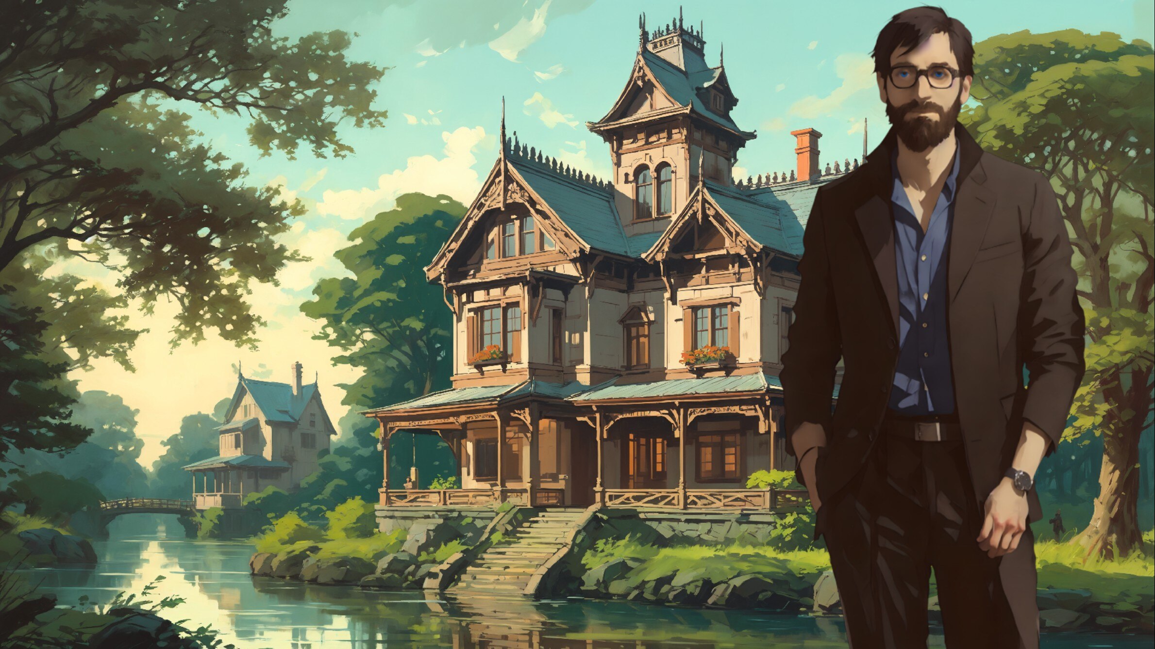
Putting that aside, nothing about Innsmouth 22 redeems it. It is notionally a new take on the H.P. Lovecraft Shadows Over Innsmouth and Dagon stories, and that’s a fine subject given that the stories are two of Lovecraft’s strongest, but that initial promise is let down almost immediately by the art being AI-generated.
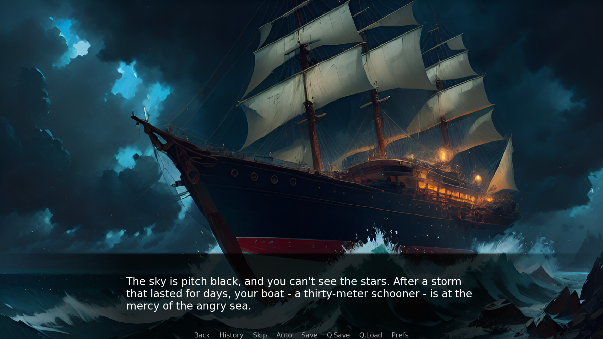
The backgrounds are totally inconsistent, looking very much like the developers just found the “best fit” option from a library of generic backgrounds. Where cities are depicted (such as Innsmouth), the half dozen or so backgrounds that your character will move between make it look like he’s teleporting from one part of the world to the next rather than moving through a coherent city.
Those same backgrounds also look like they’re from entirely different art movements at times. Some backgrounds have an impressionistic quality, while others have clean, sharp lines that look like they come directly from DC comic books. Thanks to this, a hotel room looks like it has distinctly different décor to the hotel lobby. A dockside looks like it comes from a different era than the nearby restaurant and church, and so on. Right off the bat Innsmouth 22 has no atmosphere not gravitas because nothing about how it looks is coherent.
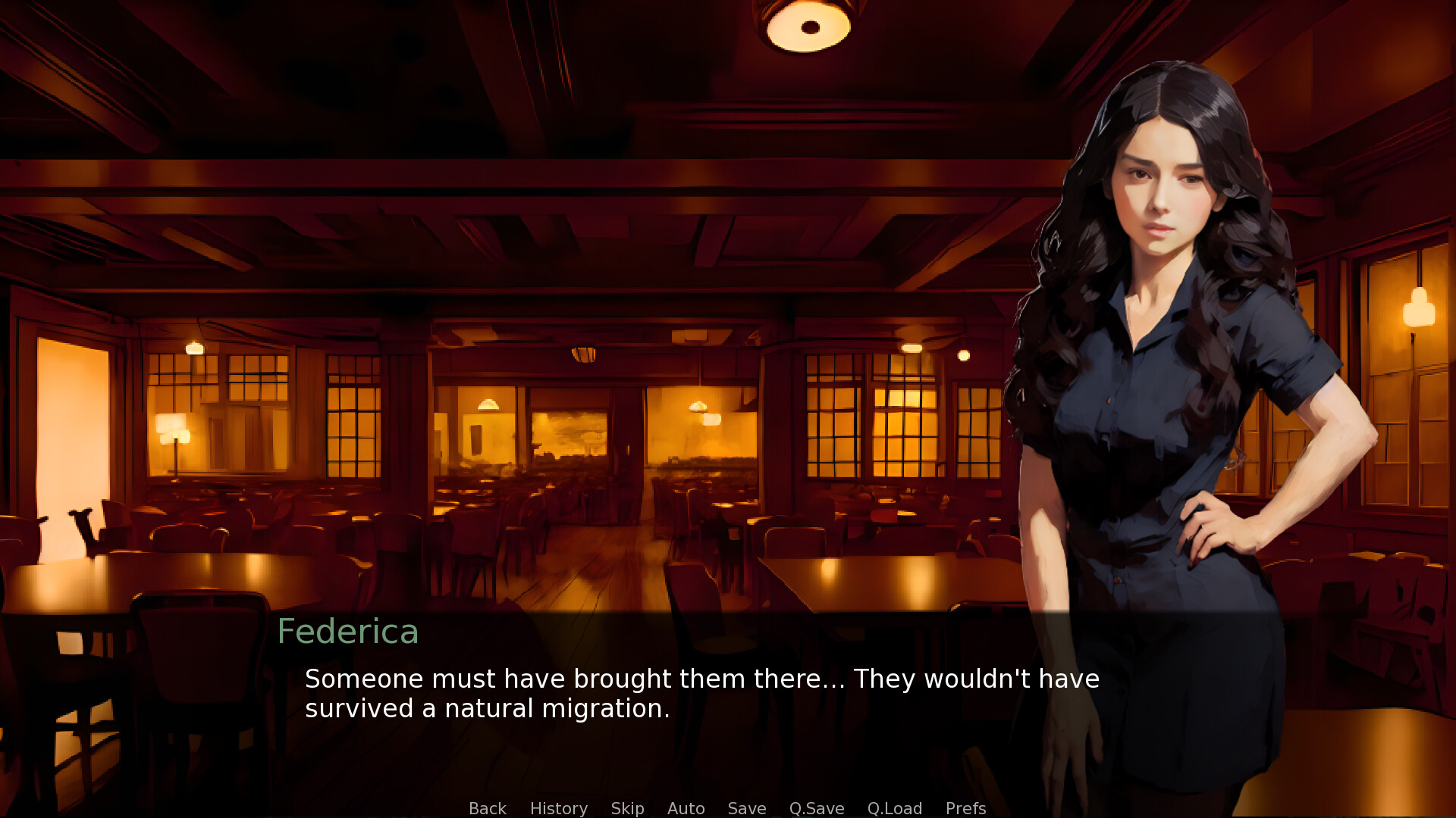
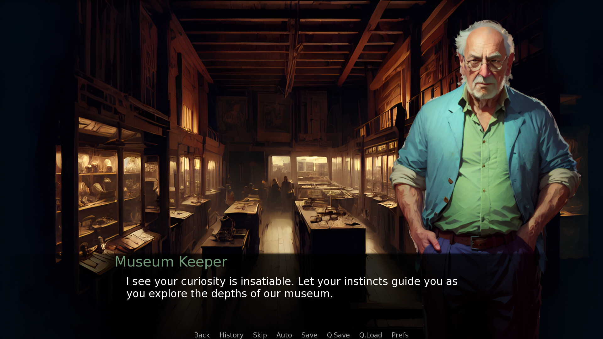
Character models, which are also clearly drawn by AI, are also just incredibly odd to look at, and again the developer has done nothing to consider setting or tone. In one particularly amusing scene, the protagonist catches a boat ride to go diving, wearing his suit, while all the other male passengers are stripped down for swimming. But none of the female passengers even have a sprite (despite having spoken lines), and the tour guide, who is female, is also fully dressed. I have no provable way to explain why the developers wouldn’t take advantage of the one benefit to AI, which is to be able to create unlimited content, and just produce new costumes for each of these characters on demand, but I suspect they were really struggling to prompt up a coherent set of sprites that covered the full gamut of situations the narrative describes.
I suspect without proof that in their efforts to make the sprites look like something pulled from the Call of Cthulhu card game (and, perhaps, some other Lovecraft mythos board games and RPGs) the developers snookered themselves with a less-than-totally-generic aesthetic approach for the sprites. Then, a lack of certain visual themes (such as women in swimsuits) in the training material excluded them from being able to create these sprites. Again this is just a pure stab in the dark at how a game with AI-generated art could somehow be missing character costumes and entire character sprites. Whatever the reason it’s not like we’re missing out on anything with those sprites missing because the sprites that are in the game are of a universally unappealing quality.
The game was initially written in Italian, and very poorly translated into English (whether AI had a role in that or not I don’t know). H.P Lovecraft was many things, but one undeniable quality of his was a poetic, lyrical writing style and beautiful use of words that ensured that the nightmares of his work had a very specific impact on the audience. This game’s script is poorly paced with frequent pointless digressions, and when it is time to ramp the horror themes up, the language lands with no intensity or sense of fear. Really the only intriguing thing about the storytelling is the brief appearance of “Howard Lovecraft” himself, but tonally he’s no different to the protagonist, because the writers had apparently skipped the classes on characterisation in their creative writing courses. Certainly, there’s no evidence that anyone involved in this project spent the months it would take to read Lovecraft’s copious letters to fully get “into his mind” and give us a character that actually “sounds” like the real person.
I know it might seem mean for me to go hard at a visual novel by an indie developer, but on so many levels this project makes me feel squeamish – and not because it’s offering good horror. Innsmouth 22 is claiming to be Early Access as a blatant shield against criticism. The developers have relied almost entirely on AI to “create” the art in the game. It’s not a tool that has helped a real artist work more quickly or effectively. It’s the “lead artist,” which is not only ethnically questionable but has resulted in a game that looks like a haphazard patchwork rather than a coherent project. To cap things off, the writing is both flat and poorly translated. I have no doubt that the developers really wanted to create this game, but they were, simply, incapable of achieving delivering on the creative ambition that a project of this scope and style demanded.
To finish with a comparison: A game like Light de Deux highlights what can be achieved when an indie developer properly scopes out their resourcing limitations and works within that. No AI, no case of scope overwhelming the capabilities of the developer. It was a smaller-scale game, but a complete, lovely little thing to actually experience. Lovecraft wrote many smaller-scoped stories and the developers of Innsmouth 22 could have retold. It might have been a better idea for them to work towards Innsmouth 22 over a period of time after first starting with some smaller efforts that would get their creative processes, art assets, and cash flow working first. Sadly first impressions count, and no matter how intriguing the game project, if this developer makes a second I’m going to be much more wary about giving it my time.
