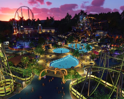
So, last week, we discussed the role of music in games in our DDNet team debating session. This week we thought we’d continue on that theme, and discuss the role of graphics in games. Is it just the hyper-realistic stuff that counts as “good graphics,” or is the visual artistry of games more broad than that?
Also; are pixels beautiful, and just what are the better looking games out there? Graphics in games is a topic that gets discussed a lot, but often on a superficial level; frames per second, or counting polygons. Rarely do we talk about styles and approaches to graphics, and what they do for the games in question.
Matt S: One of the things that I always find so fascinating is this assumption that older games have “weaker” graphics, as though the quality of a game’s art is directly related to the polygons that go into it.
Matt C: Realism is what all games should strive for. But on a more serious note; all the hardware power of PS4, and it’s still rare to see games that look as good as bargain bin SNES games.
Matt S: It’s a very common perception though, in all seriousness, and I find it odd, because really, some of the most beautiful art out there in games is done with sprites… or minimalist tones in modern games.
Final Fantasy VI was a beautiful game, and the art just can’t be replaced without pulling the soul out of the game. As we saw when Square Enix remade the art for the mobile port of Final Fantasy VI and no one liked it.
 |
| Is “realism” good graphics or… |
And some games do a remarkable job with the whole realism thing, of course. Horizon wouldn’t be a game worth paying attention to on any level if it wasn’t for the incredible, epic art that drove it. Or for a more “raw” example, if you’re going to make a game that aims to be sexy in style, aka the Dead or Alive series, you kinda have to aim for detailed, realistic, character models.
So I don’t mean to suggest that there’s any one superior approach to art in a game. Rather, there are a number of different approaches that can be taken, much like as an artist in the world of painting can do realism, or cubism, surrealism, impressionism, pop art and so on, and each of those styles is equally valid. What’s important is that we start to recognise that pixel art, or minimalist art, in games, is every big as “artful” as the most hyper-detailed, realistic, AAA-game.
Matt C: So many developers see hardware power = realism = better. nd to be fair, they’re targeting an audience that believes that too, but I honestly think that, overall, 16-bit was the best generation for art direction.
I also think it’s an interesting debate to have as VR is finding its place. The logical idea is that realism = immersion for V, but, at least for PSVR, the hardware just isn’t up to rendering photorealism in any kind of authentic way. The resolution is too low.
But then you play something like Fated: The Silent Oath, which eschews realism and focuses on a unique artistic vision, emotive use of colours, expressive cartoony characters, and it’s so much more immersive than the same game would be with realistic graphics
Matt S: With VR I’m rather hoping that “realism” isn’t the end goal, as there’s a steep uncanny valley experience there, I feel. I’d much rather VR head off into much more abstract places. I’d rather play Gal*Gun VR than Call of Duty, in other words.
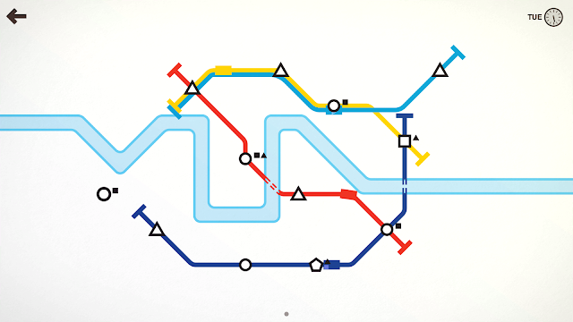 |
| … or is the sheer minimalism of Mini Metro where it’s at? |
The other great problem with realism is that those games age as technology gets better, and it doesn’t take long for the “realism” that made the game so impressive in the first place to be replaced. And what are you left with then? A game that everyone says has “dated.” I remember when there were games on the PlayStation One being touted as being so “realistic,” and how many of them are still considered visual masterpieces? None. Meanwhile, the games that have that timeless artistic quality are games like Mario 64 or Zelda: Ocarina of Time, which are much more abstract.
Or even on the PlayStation 2. Compare the old Medal of Honor games, which aimed to be the most realistic takes on war shooters back then. None of them hold up in comparison to the modern Battlefield or Call of Duty games. But which game looks as good and “modern” today as it did back then? Killer 7. Because Killer 7 was as abstract as game art gets.
Matt C: On the other hand, I see a lot of pixel-art games that similarly lack soul and art direction.
Matt S: Yeah, with pixel art I find that happens a lot with a lot of modern games that use that pixel aesthetic; usually they’re games developed by indies as a way of “hiding” the limited budget, but pixel art that doesn’t have a reason to be pixel art isn’t memorable.
Ginny W: I think the problem with a lot of pixel-art releases is that they’re either a) as Matt described or b) trying to capture an extremely specific sense of nostalgia. They’re not necessarily using the format as a means of artistic expression, just using it as a potential sales vehicle.
Brad: I think I’ve reviewed about a million 8-bit inspired games for DDNet (give or take one or two games). A lot of them are missing a key element. The reason why that game needed to be 8-bit (or 16-bit) in the first place. Games like Shovel Knight and Slain achieve this. Games like Chronicles of Teddy not so much. If Shovel Knight or Slain had “HD” art, they’d be awful. If Teddy had “HD” art it’d make more sense.
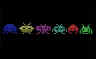 |
| The space invaders are cultural icons, and it’s not because they’re “poor” graphics. Quite the opposite |
Harvard L: I think there’s definitely a debate to be had over whether pixel art is what makes a game “retro”. DuckTales Remastered and Double Dragon Neon were both fantastic and made the most out of modern graphics
But having worked with pixels, I think there’s more leeway given to the artist – their work doesn’t need to be bound to real-life conventions as much, and there’s better control over how many frames a certain animation would take
Moshe R: I think we are talking about two different things here. As far as games are concerned, each has its own demands on graphics. Games like chess, or its close relative Fire Emblem, do not require great graphics. Games like Space Invaders have lasted in our collective minds for decades because they only have primitive graphics (as well as other reasons). Games such as Mini Metro thrive on their minimalism.
On the other hand, we have the manufacturers and their need to make money, or rather their need to make us spend money. It makes a whole lot of reason for them to convince us to get the next big rig so that we can heroine’s hair in Horizon Zero Dawn would wave just so majestically. But does it make a great game? Not necessarily so. Yet when I start the game I consider my all time favourite, Mass Effect 3, it’s been years since I’ve been able to enjoy the game the way I used to; it’s just doesn’t look good enough anymore.
As for pixel art, I see them as just another creative way to “sell us” more stuff when the ability to go to the edge is unavailable. Not that there’s anything wrong with that.
Brad L: I’ve found more recently that it’s been hard to go back to games, even the PS3, because they tried to push realistic graphical boundaries at the time and it’s just not engaging. Meanwhile I can still play Donkey Kong Country on the Wii because Nintendo has this way of hiding graphical issues so its games hardly age. Breath of the Wild looks beautiful despite running on less powerful hardware.
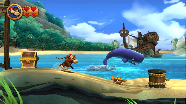 |
| Colourful, abstract games like Donkey Kong Country never age |
Matt S: I guess that’s why I generally prefer more abstract approaches to game art. And I mean, when you dig into art as a whole, when has “realism” ever been timeless? The Mona Lisa, perhaps, and some of the religious art that tends to aim to be “realistic” in order to inspire the soul, but really, the art we all remember is stuff like cubism, impressionism, and so on; unrealistic approaches to subjects which are unrealistic so that we can focus instead on the message of the art work.
And I think that applies to games as well; with very few exceptions, I find that games that aspire to “realism” in their character design tend to ask us to actually focus on the art, rather than use the visuals as a vessel towards some greater meaning.
And because this industry is tech-obsessed and there are people out there that genuinely complain if a visual novel doesn’t run at 60fps, of course a technical detail like Lara Croft’s hair or Aloy’s photorealistic motion capture gets more coverage than the plot of either game.
I’m meanwhile sitting here thinking that NieR Automata is the most attractive game released this year because it’s so subtle and yet also visually dense. The game tells a melancholic story, and the art is melancholic. Sounds so simple, but so few game developers actually “get” that.
Matt C: I’ve seen so many people complain that NieR Automata is “ugly” or “bad.”
Matt S: As have I. It’s a fundamental misunderstanding on their part on how art works. I would bet a significant amount of money that those people that think that don’t spend much time at art galleries.
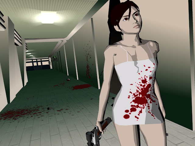 |
| Killer 7 is a PlayStation 2 game that looks modern to this day |
And that’s fine on one level. Not everyone wants an art gallery in their games. Whatever. What’s important is that we, as an industry, work to shift the discussion away from this idea that “realism = good graphics.” Realistic graphics can be good, sure (at least, as long as they’re current), but that’s just one approach. Not enough critics write about how beautiful games are that aren’t “realistic.” They tend to talk about them with qualifiers of pejoratives thrown in. For example; I remember a lot of critics chalking The Unfinished Swan up as “simple.” Simple’s not a word that we should be using to describe games that aren’t realistic.
Matt C: I would agree with you about NieR Automata being the most attractive game this year if Persona 5 hadn’t just come out.
Persona 5 is a game that’s overflowing with style, and has such unique art direction. It’s not realistic by any stretch, and the technical quality of the graphics isn’t nearly up to what PS4 is capable of. But it looks absolutely beautiful, and it cleverly uses those visual themes and motifs to tie together a story about youthful rebellion and generational conflict.
Matt S: I think I’ve said this a couple of times before now, but what Persona 5 reminds me most strongly of is Andy Walhol. Different subject to what that great artist generally focused on, of course (though I guess that’s debatable, as Persona 5 does have a conversation about consumerism running through it, which was a favourite of Walhol’s), but rather, the overload of very rich colour reminded me most heavily of pop art.
It’s vibrant, that’s for sure. It takes a very talented team of artists to create the kind of depth of colour that Persona 5 offers, and it’s one of those rare games that you’ll want a really nice TV in order to fully enjoy.
Matt C: Yeah, my TV doesn’t do it justice. It looks better when I remote play on Vita.
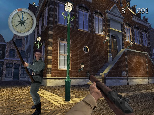 |
| … You’d be really stretching, however, to suggest that Medal of Honor on PS2 holds up today. |
It’s kind of… pop art mixed with graffiti, punk, surrealism. Perfect fit for that game. And that cuts to the heart of it, really: it’s a game where you can talk about the “visuals” on a deeper level than just “it looks good, nice one”. For a visual art form, that’s integral, but so many games miss that.
Moshe R: I think the Persona games definitely nailed a unique look that, at least through my limited 3DS exposure (with Persona Q), works so well. Whenever I see a screen image of a Persona game I immediately know it’s a Persona game. A lot of companies pay a lot of money to achieve much less in the branding department, but the point is – again – that art beats realism.
Another way I like to approach the question of graphics is by looking at games like FIFA, or Pro Evolution if you’d like. We have a new FIFA every year, and I’ve been with FIFA since 1996 (give or take a year).
One of the problems EA has with FIFA is to do with “encouraging” people to buy it year after year. Most of the people that do so do it because they want to play the same game that’s been played this Saturday, lineups and all, but EA also tries to improve the looks every year. The question is, does improving the graphics make a better game?
I have seen enough FIFA examples to conclusively argue this is not the case. FIFA 99 was way better than FIFA 2000 (99 was by far my series favourite), and along the years they often improve the graphics but missed out on the game. I like my football very tactical, almost like a board game in fast forward, whereas the emphasis lately has been more on the personal skills of some big names that help sell the game.
Matt S: On the other hand, for sports games, it’s hard to deny the atmosphere is important, especially when you buy them only infrequently.
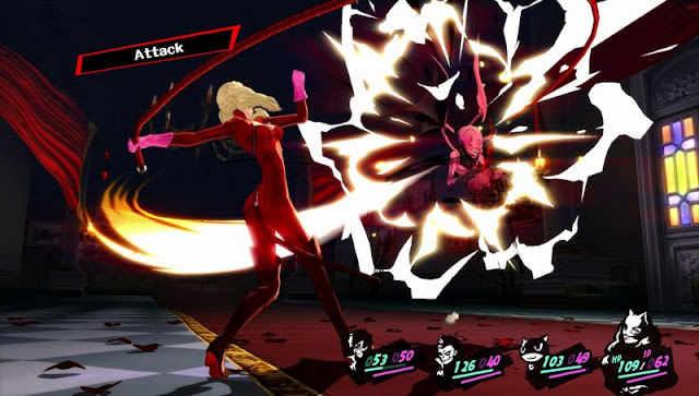 |
| Persona 5 is overtly beautiful, with an incredible mastery over colour and contrast |
So for example, look at baseball. This year we have the choice between the brilliant MLB The Show, and the pitiful R.B.I. Baseball. I’d be lying if I denied that one of the reasons that I think MLB is better is because it has a much more attractive approach to fields and character models. I feel like I’m more “in the game” with MLB, and that R.B.I, in addition to playing poorly, struggles to make me care about any of it.
Moshe R: You’re right about the atmosphere effect. I remember what a difference it made when FIFA added realistic ads to the side of the pitch. It’s ads, yet it goes that step extra towards making you feel like you’re there.
This leads me to hypothesise that the graphics we accept and look fit is heavily related to our own personal expectations.
A decade, say, from now we will not accept anything that’s not VR because almost everything will be VR. Unless games market themselves as classic/retro, the way the pixelated look is going at the moment.
If I’m right, then it implies that if you’re a user of the latest and greatest liquid nitrogen cooled rig, anything less than 240 frames per second would look awful. Just because that’s what you’ve conditioned yourself to expect. On the other hand, if you’re like me, someone who rarely gets to spend an hour or more of straight gaming, you get used to iOS graphics and the 3DS is plenty good enough.
Ginny W: Also that VR thing you mentioned Moshe is interesting. As someone who’s wildly motion sick, I really hope that in a decade, someone’s going to have stabilisation tech that will stop me from wanting to puke whilst watching someone draw a flower in a VR game.
 |
| NieR: Automata, meanwhile, is gorgeous, in a subtle, artful way. |
A lot of the games that we’ve mentioned have made the visuals an incredibly specific and meaningful part of the game. It kinda wraps around to what I was saying earlier about how the difference is when art is being used as a vehicle for the game vs when it’s composed as part of the actual game experience. Persona 5 is an incredibly good example because it has a specific style that is recognisable and powerful (built through the franchise, of course) and it’s a modern game in the age of fancy hardware without aspiring to hair physics. It’s still affecting and we all love the look of it.
Moshe R: Regarding VR and motion sickness, Ginny, I’m sure that in a decade they’d be able to install the latest Nvidia chip in your head that would sort out all your problems (based on the information they have been collecting on you since getting the latest Nvidia driver now requires a login). [And I’m sorry for taking the discussion there, it’s just that I’m very sensitive to matters of privacy.]
But you are right, there is a technical problem here where technology gets to the threshold of physiology. Graphics can go a long way into fooling your eyes, but to date they have been unable to fool your inner ear. Prophecy has been given to fools and I won’t pretend to know how we will be playing games in the future (although my wife would vouch for me in the foolish department), but my money would go towards more mobile friendly solutions (smartphone / 3DS / Switch) like where the bulk of the processing is done on the cloud. So not VR in the sense of transforming you into an entirely different universe, but a very living universe at the palm of your hand (and by living I mean it doesn’t have to be lifelike, it can be very Persona like).
Matt S: After previewing a certain game recently (which I can’t mention just yet) there is something else I’d like to mention: I can’t stand it when a game has “cut scenes” that use a different engine and end up looking significantly different to the in-game graphics. Why go to all the effort making a super-gorgeous, cinematic series of narrative cut scenes, only to break the immersion completely when those cut scenes are broken up with gameplay sequences that look terrible by comparison?
I honestly thought that trend, which kicked off with the PSOne where FMVs were used to give characters character (because in game the characters looked like an ugly mess of polygons), would have died off when in-game engines started being able to render stuff of the quality of, say, Horizon.
Harvard L: What would your opinion be then on the cutscenes from Mirror’s Edge? Or The Witcher 3? Where they cut away with a completely different art style to the main game? Because I’m really not a fan of that but I feel like that’s a trend we’re moving towards.
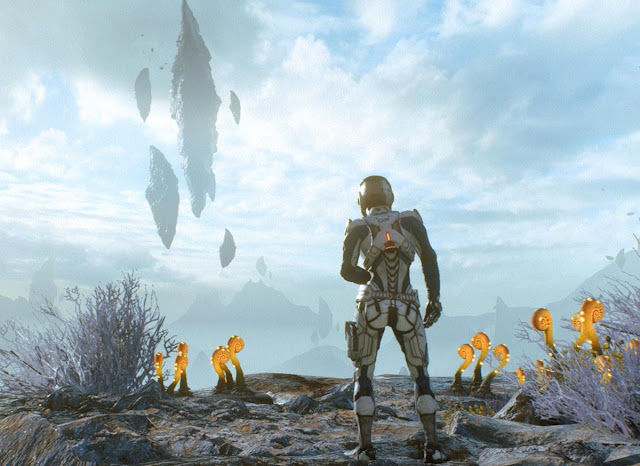 |
| The great problem with big AAA-games is that they age. What is gorgeous now, isn’t going to be gorgeous in a decade. |
Matt S: When it’s a stylistic thing, that’s a different story. Like, if a game were to transition to comic book panels or 2D dialogue sequences or whatever, then that’s fine. What I’m talking about is more to do with the developer pushing a cinematic engine as far as it can go, and then pushing a gameplay engine as far as it can go, except that the gameplay engine can’t quite do what the cinematic engine can do, so it just looks like there’s a shift between cinematic and then still good looking but blatantly a game now.
Harvard L: Yeah I can’t think of many modern games that do that anymore.
Matt S: Yes, there aren’t too many examples of games that still do it. For the most part developers aim more for a seamless experience where narrative is told in-engine, rather than through cutscenes at all.
Harvard L: I do remember Mafia 3 had those jarring transitions between cutscene and gameplay. It also had gameplay-cutscenes which were clearly done via the gameplay engine since they were just two characters standing, talking to each other without gestures or anything
But it gave the game as a whole a nice cinematic quality. It’s like, after you’re done playing for a while you’re rewarded with a movie to watch.
Ginny W: One game that sort of has a very different cutscene “look” to it that I’ve played recently is Tales of Berseria. We’re not expecting Tales games to have Horizon ZD levels of realism when it comes to the graphics because that isn’t their schtick but in this day and age it’s definitely much more noticeable and jarring.
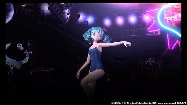 |
| … But Miku will never age, because these games are clean and artful, rather than complex. |
I mean the cutscenes were basically Tales of Zestiria X the anime.
And the game itself was very much, well, typical Tales. Everyone walking and running like they’ve got angled rods up the bum and so on.
I have to say though, the Tales dialogue delivery hasn’t aged very well to me. Not sure what it is on the handheld experience vs Berseria but I just didn’t have the patience for the animation’s subpar emotional expressions and the one-liners that didn’t really go anywhere anymore.


