I love playing cricket on the go. I think it’s because of the longer span of time that it takes place over. With football, or ice hockey, or tennis, or volleyball, a game’s over in under an hour (when playing in video game form) and so, consequently, when I sit down to a game I want to finish the entire game in a sitting. But with Cricket, because a test match (my preferred format) takes place over many, many hours, saving and then coming back to it later is downright necessary. That also means it’s the perfect commute sport. Play for an hour on the train in the morning, then another hour on the way home. Make some progress, take a break, and play some more the next day. It’s how test cricket is meant to be.
With that in mind, I’ve always preferred the Switch ports of Big Ant’s Cricket series. And that’s been a roller coaster and a half. Cricket 19 was barely functional at launch, with players (particularly in the outfield) “teleporting” in place of running. That was thankfully subsequently patched and it ended up being a quality port.
Thankfully subsequent releases have been better out of the box, but the new one, Cricket 24 is painful in some ways too. To be clear, I am going to get a lot of play out of it, and I don’t inherently blame Big Ant for these issues, but I’m also quite certain that this will be the last time Big Ant releases something on the Switch, so we’re going to need to find a way to enjoy it. Hopefully there’s at least one patch on the way to clean up some of the more egregious issues that I’m about to lay out.
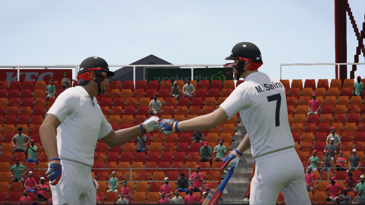
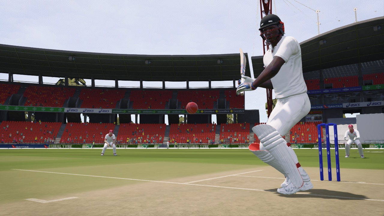
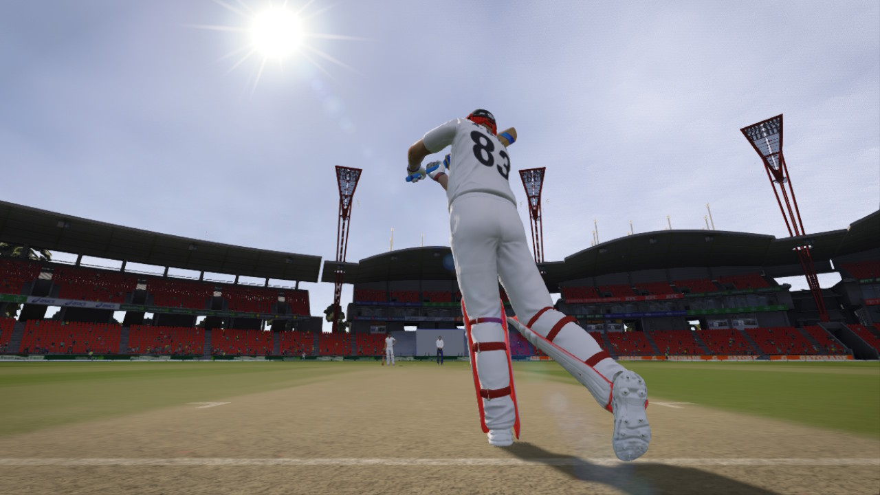
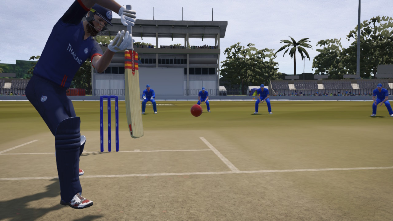
The long-and-short of it is that the effort to compress Cricket 24 to make it work on the Switch has made it… quirky. The character models still look rather good, especially close up. All the screenshots you see on this review were taken directly from the game and, looking at them in still form, they all look perfectly fine for Nintendo’s diminutive handheld. Big Ant has always had an obsession with the quality of player renders that borders on the fanatical, so it’s not surprising that they would preserve that as far as possible with the Switch port. However, the game’s shadow engine is almost totally broken, and that’s something you need to see in motion to understand just how bad it is. In any given cut scene shadows flicker over a character to the point where it looks like they’ve gone through a time-lapse, with the sun moving from morning to evening, in the span of a second.
Meanwhile, the many (many) licensed ovals are rendered nicely enough, but because of memory limitations, the crowds are anemic, with just a few people among seas of empty seats. A good example of that is the screenshot below. Being brutally honest here, this is about right for much of the test cricket experience around the world. It’s a dying format for the sport. But you’ll also see exactly the same empty stadiums when you play T20 cricket, and that version of the cricket does tend to fill out at least a few stands, so it becomes immersion-breaking there.
And, finally, there are some really weird glitches at times. I created a “Japan” team (as I always do with Cricket games, putting myself and pals into it), and set Sydney Olympic Park oval as the home ground (I like that one). That ground has orange/red, and it’s almost impossible to watch a cut scene while playing on that one, because the seats alternate between those two colours like it’s TV static, and it’s enormously unpleasant to look at. I’d capture video, but video capture has been disabled on this game.
As I said, I don’t inherently blame Big Ant for making a game that is reduced compared to the big TV console versions. Cricket 24 is a very big game and the team had to try and squish it down to a fraction of the console vision. I don’t begrudge that it is a compromised experience in the slightest.
What I do begrudge is that the developers don’t seem to have been interested in making the right set of compromises to arrive at a game that feels good on Switch. Why keep an effort at a dynamic lighting system at all, if it’s bugging out? Implement a less realistic, flat lighting system that is, at least, not distracting to look at. The small crowd numbers is totally understandable, given that the memory needs to be saved for the actual gameplay, but why not make sure the seating wasn’t going to flicker between two colours with a violence that could potentially trigger an epileptic fit? I realise that the Switch port of Cricket 24 was likely anything but a priority for Big Ant, but with a bit more care we could have had a game that was reduced in a way that at least felt optimised and therefore good in the hand.
Speaking of optimisation, we’re on the third Cricket game on Switch, and I’m disappointed that so little has been done to account for the Switch hardware over that time. When playing in handheld mode, so much of the text is tiny to look at, and this is because the font and UI is unaltered from the console versions. Additionally, the Switch Joycons have some unique limitations, such as a lack of analogue controls in the shoulder buttons, and nothing has been done to compensate for this. This makes things like the replay function infuriating to deal with, because frame-by-frame fast forwarding and reversing relies on the analogue shoulder inputs of a PlayStation or Xbox controller. On the Switch, this really needed to be remapped to the control sticks or something. As that hasn’t happened, replay is functionally useless. You might say that the replay mode is hardly an important feature, but these things all count. I don’t expect Switch games to run to the same fidelity as on my PlayStation 5. I do prefer to play Switch games, however, and I don’t think it’s unreasonable to expect that they at least feel like some effort has gone into making them work on the console.
For all these gripes, it is still Cricket 24, and as I wrote about in my review of the game on PlayStation 5, Cricket 24 is a very good game, with a ridiculous depth to the licensing and play modes in particular. In raw content there are hundreds of hours of play involved if you want to see everything, and while some of it could have been better differentiated (each T20 mode has different team colours and stadia, sure, but otherwise each mode feels the same to play), it’s still nice to see the overwhelming bulk of the cricketing world represented. Most cricket fans have been waiting a very long time for someone to to achieve this. And Big Ant’s willingness to persist in overcoming the licensing hurdles with the way the sport is organised is admirable.
The only thing that’s really missing is some kind of team manager mode, where you need to set up tours, manage finances and team rosters and then also win matches on the field. There’s a career mode, which is fine albeit could use a stronger emphasis on storytelling, but a manager mode would really help fill things out.
My criticisms of Cricket 24 on PlayStation 5 also apply to the Switch version. The AI in particular is still very arbitrary and, especially with bowling, you will always feel like you’re waiting for the game to decide that it’s time to give you a wicket rather than skill on your part earning the wicket. But then again I wasn’t expecting Cricket 24 on Switch to somehow address the issues of Cricket 24 elsewhere. It is, after all, a downsizing port rather than a new game.
I’m going to get dozens of hours of play out of Cricket 24 on Nintendo Switch, of that I’m sure. I am very disappointed in how the development team has gone about optimising the game down to fit on the more modest hardware, and the portability of the Switch has to be a major selling point for you to go for this version over the objectively superior console versions. But it’s still Cricket 24 on the go, and that’s a critical hit right to my weak spot.
Buy the hottest games with Amazon.
By purchasing from this link, you support DDNet.
Each sale earns us a small commission.
