Some people like to find ways to murder people in the Sims. I’m not saying I’m one of them (I’m far too impatient) but it’s not an uncommon occurrence. If you take that idea, and put it into a haunted house with a smidgen of plot and some tower defence gameplay, you get Horror Tycoon. It’s a game about making people’s fears come to life so severely that they’re scared to death.
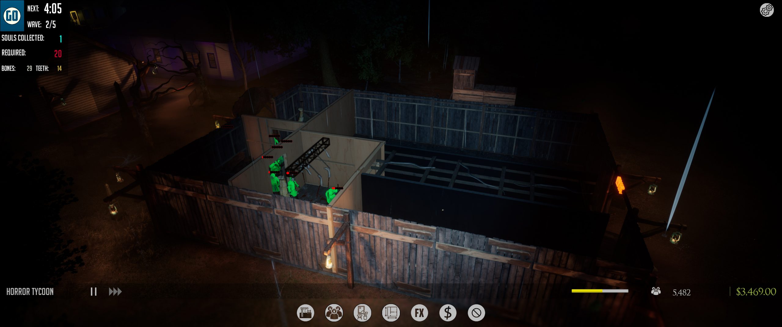
The gameplay basics are quite simple. Build a haunted house using walls, scare traps, decor, FX (lighting, smoke, etc.), and more. Guests will start arriving in groups at regular intervals, and players can keep building during this time. Kill a certain amount of people in a certain number of waves, and you’ll progress to the next haunted house and start all over again. The more you progress, the more people need to be scared to death.
What I played is a “playtest,” not nearly the final game. In-game it states that it’s pre-alpha. In my opinion, there’s still a lot of finicky work needed to get Horror Tycoon to the point of a full launch; I also think it was a little early to release it to the press for previewing purposes considering its current state. Everything from UI to the tutorial and even starting the game can use a lot of work. I’m definitely intrigued to see the final product, but it’s not necessarily something I’m loving right now..
The scary stuff available at first is relatively expected: bloody body parts are the most common, and there are also things like jump scares. I found the best way to design the haunted house is to kind of make a snake of rooms from the beginning to the end. I like to theme my rooms, so at first they were all basically themed the same way: bloody. As you collect souls (and, as a result, bones and teeth – ew!) more scare items unlock. I’m especially fond of the creepy hallways that can connect rooms.
Here’s the thing though: even getting to just that point is painful. The tutorial is incomplete and doesn’t explain basics like rotating attractions (you have to check the command list to find out). Tutorials need to encompass everything in the game, though, and when the game isn’t done yet it would be whacky to expect a full tutorial. What would help replace a full tutorial is more options for pre-built rooms, especially early on. In the first level, you have one choice; and it’s not even a room, it’s a barrier! I’ll just put a wall somewhere if a need a barrier, thanks.
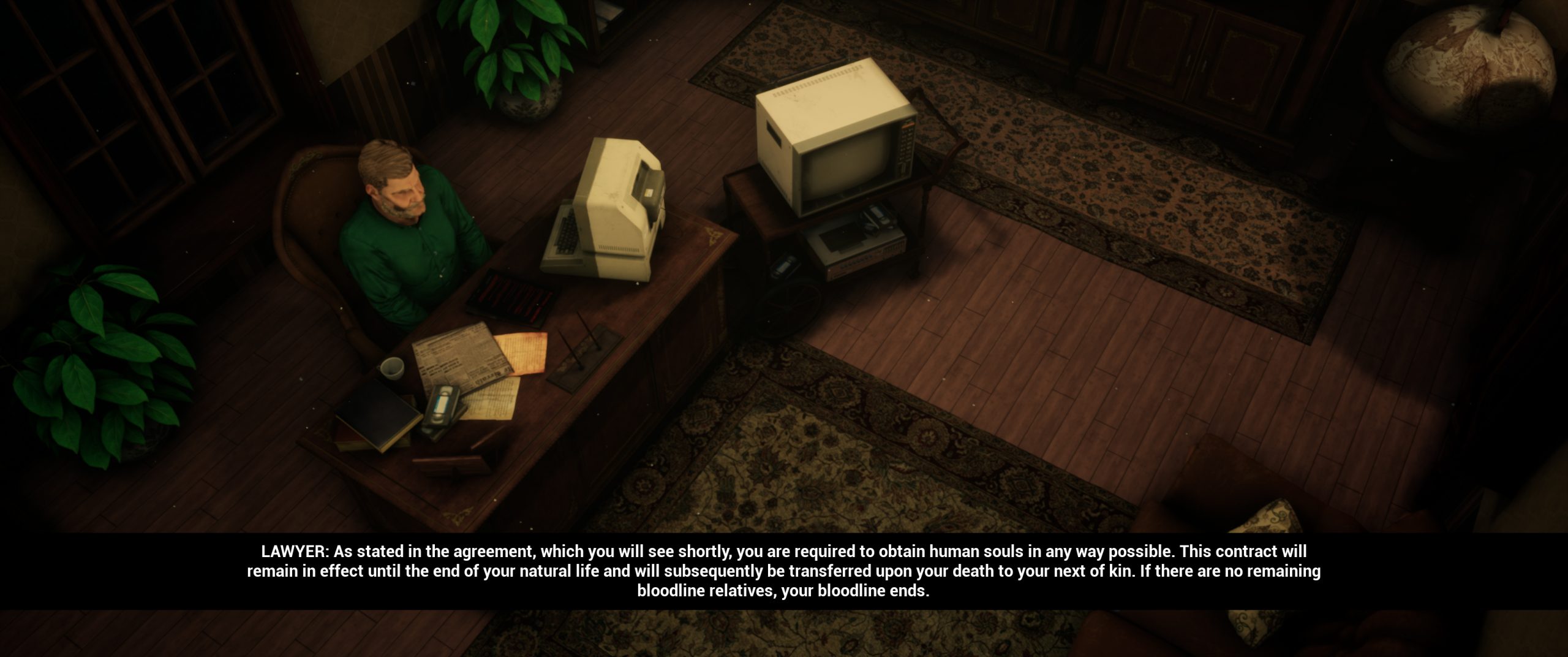
It’s expected that you will fail at some point, because that’s how you learn what needs to be done (hello, reflection on life). That means starting a new game. That would be easy if you didn’t have to sit through the initial cutscene again. And again. And again. It’s in desperate need of a skip button. The story has taken up space in my head now, I’ve seen the intro so many times: family made a deal with the devil, now it’s on you, the cops won’t come, go forth and create. Except it’s far more drawn out than that.
The atmosphere is acceptably creepy. The area is dark, the music is spooky. The music is also far too loud when compared to any voice work, to the point I didn’t even know there WERE voices until I once opened the game not realising the volume was cranked up.
As far as difficulty, I find it incredibly hard but that may be more because of my impatience to get things going instead of something wrong with the game. I’ll spend half my money and be like “done!” then wonder why nobody is being sufficiently scared. A big part of the impatience comes from the repetitiveness and finicky nature of placing walls and things while the camera controls are a pain. Not just the cameras, too: sometimes I get stuck in trees when I’m trying to move the camera to a point where I can almost maybe see things.
When it comes to the actual hordes, they seem balanced enough. They come at reasonable intervals, giving players time to use those bones and teeth they’ve collected to fill the haunted house to the brim with even more scary objects, killing more than before in the following horde. The amount of bones and teeth required to get new items seems kind of high, but again that could just be my impatience talking.
Looking back over what I’ve just written, one word jumps out: patience. You need an awful lot of it to enjoy what’s going on in Horror Tycoon at this point in time, mainly because of the difficulty placing objects, issues seeing where they’ve been placed, and wonky camera angles/controls. The basis of a solid game is here, it really is (despite my complaints). I could see myself enjoying it in the future when gameplay is more streamlined than it is right now, with more explanations on how to do things properly.
Horror Tycoon’s playtest is available via Steam until June 2.
