I like the ambition and appreciate the effort that went into Infinite Adventures. Sadly, I don’t think it was executed very well, at all. The idea of doing a grand dungeon crawler in the tradition of Etrian Odyssey, with some randomised level layouts for added replay value, might sound good on paper, but it would take an incredible developer to deliver on that, and this was clearly beyond the abilities of this team.
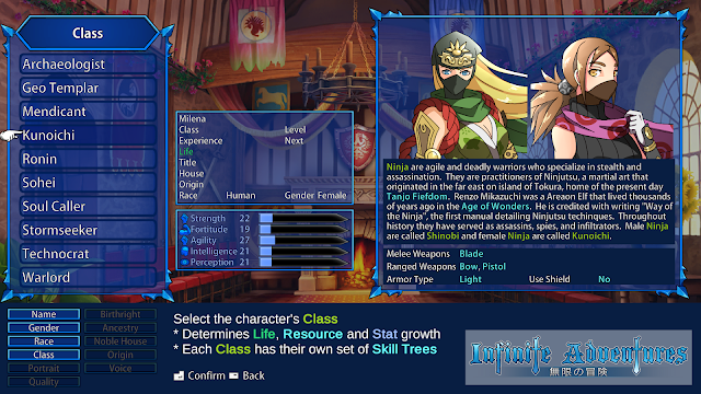
The presentation is an immediate red flag. The character portraits certainly look nice enough, but it’s a matter of quantity over quality, as the developer had to create a lot of them to go with the huge number of classes and races that are available in character selection. Enemy monsters, meanwhile, are cartoonish without charisma, looking like they are still grabs from bad morning children’s cartoons. This is all tolerable, however. Where things become unacceptable is with the UI and sheer walls of text that the game throws at you. I get that Infinite Adventures has a lot of lore and “story” to share, but filling the screen with long paragraphs of text isn’t the way to do it. I shouldn’t have to spend an hour reading dozens of pages worth of backstory just to figure out what part of the world I want a character to come from in character creation. A more experienced developer would find ways of articulating that through the adventure itself. Likewise, once you’re in the game the interface is clumsy and messy. It took me a few moments to figure out how to use potions on characters outside of battle, because you can’t do it from the main menu, where the inventory is listed. Instead, you need to pull up a secondary menu from the main screen and… it’s a mess. The team would do well to invest in a proper user interface designer for future efforts.
I’ve saved the worst for last, though. The voice acting. So rarely in games do I feel an overwhelming urge to turn voices off, but this one did it. Not only is it very obvious that voices were recorded in different locations, using different mics and equipment (and the sound mixing in-game means that the volume from one voice to another is wildly inconsistent), but the accents also come across as very forced and the delivery of lines is wildly inconsistent. It’s like the developers held an open call for voice actors, provided them with scripts to record in their home studios, and then didn’t bother to actually direct the project. Now, in fairness to Infinite Adventures, there is a lot of spoken text and the developers have undertaken a massive project in getting it all done alone, but I do think that independent developers should recognise their limits and resources, and work within their means. Because, as a result of these presentational inconsistencies and lack of refinement, the ultimate problem with all of this is that for all the work that went into it, I cared about none of it. Etrian Odyssey – the most immediately obvious source of inspiration for Infinite Adventures – had me hooked on narratives that were, at times, very thin. It was the quality and focus that did it. This game, meanwhile, has gone grand, but landed flat on its face.
The game is broken up into two main sections – there’s the main labyrinth, which is 24 large levels of classical dungeon crawler action, and then the “infinite adventures”, which are separate from the main adventure (they’re there for loot and experience), and procedurally generated like in a roguelike. The human-crafted levels are pretty well designed, with some neat traps, plenty of mining spots for rare resources, and lots of nooks and crannies to suss out that reward you for taking the time to carefully explore. The infinite adventures, meanwhile, highlight just why dungeon crawlers need to be hand-designed, because those labyrinths are exhaustingly dull in “design.” Traditional roguelikes get away with random level designs because the levels themselves aren’t carrying the weight. With dungeon crawlers, the labyrinths are almost a character in their own right, and it takes the human touch to give them personality. This is why developers rarely try and make procedurally-generated Wizardry-likes, and is another example of a noble effort by these developers to be interesting and different that has resulted in a wild misunderstanding about what works to the benefit of the game.
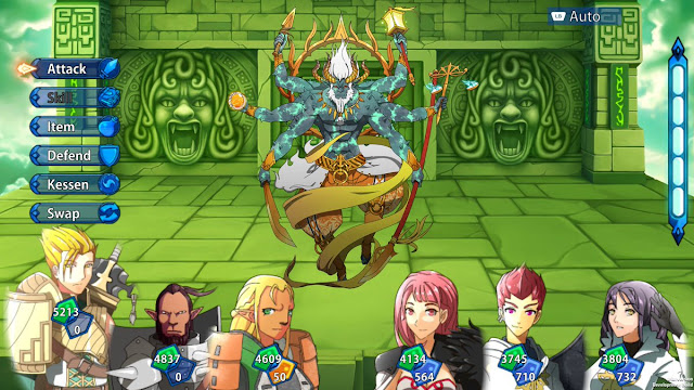
The turn-based combat suffers from the speed at which you watch the attacks play out. On the one hand, the depth that has gone into the combat system is exquisite. Characters have multiple skill trees, each tied to the wide range of classes available, so there is an almost overwhelming amount of customisation of the party and the skills that it takes into battle. Enemies can escalate in difficulty quite quickly, too, so players will need to carefully plan out strategies and make use of the resources available to them. Unfortunately, once you’ve chosen all of your attacks and hit the “execute” button, what happens next is a blur and both your attacks and your opponent’s play out too quickly to easily register the feedback. Numbers fly across the screen (it’s not always evident why), and you’ll spend a couple of moments at the start of the next turn trying to figure out what just happened. That’s a process that is complicated by the terrible user interface, which fills the screen with icons, making it hard to “read”. Eventually I found that the best strategy was to simply make sure I was over-levelled for every stage of the dungeon. It meant an excess of grinding, but it also saved my party from being wiped out when I lost interest in monitoring every attack and effect that was being applied to my party.
For all the criticisms, there are some things that the developers really got right. The big one is the ability to adjust the encounter rate. On most difficulty levels you can adjust combat encounter rates from 0 per cent all the way to 200 per cent, allowing you to focus on grinding or exploration as suits you at that point in time. The highest difficulty setting switches that off for a more pure experience, but I actually like this feature as it prevents the frustrating need to constantly backtrack every time you run into a difficult enemy, when you really just wanted to explore around and figure out where in the dungeon you need to travel next. This is also a game that balances out its loot system reasonably well, meaning that you’re never going to feel like you’re scratching around for resources, as some of the older dungeon crawlers (and earlier Etrian Odyssey titles) had a habit of doing.
Unfortunately, though, I just didn’t enjoy my time in Infinite Adventures. The first-person dungeon crawl is a favourite genre of mine, and the Switch already has plenty of those, so for Infinite Adventures to stand out it was going to need to do something special. Sadly, misfires in terms of presentation and the mistaken belief that procedural dungeon layouts are something desirable to the dungeon crawler make this game flawed on every level, from concept right through to execution.

