No More Heroes 1 & 2 was a surprise drop on the Nintendo Switch last week. It makes sense that they would make their way to the console, given that Goichi Suda is gearing up to the big release of No More Heroes 3 soon enough. Both these games are older now (being originally released on Nintendo Wii), so it’s entirely possible that newer players have missed them, and what better way to highlight what to expect for something that will be as oddball and creative as No More Heroes 3 is sure to be than giving those players the previous two?
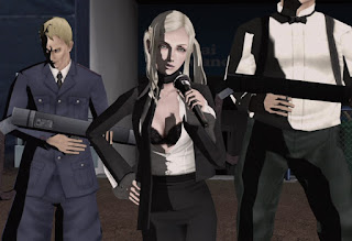
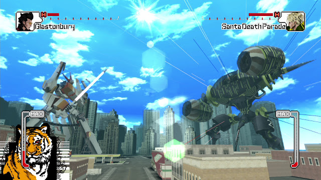
Starting with the most superficial elements first – No More Heroes and its sequel use a cel-shaded art style, and while those games from the Wii era that aimed for a more realistic aesthetic have tended to have become very unpleasant on the eyes now that we’ve moved into 4K resolution that is so detailed you can see the pores on the skin, both of these cel-shaded games still look very good. Environments are a little plain, but the smooth animation of the characters (Travis and the bosses in particular), and the simple, bold lines give the games a brightness that remains very aesthetically pleasing and modern on the eyes. In fact, these two games are some of the best examples of why strong and distinct abstracted aesthetics should be seen as preferable to a more realistic palette – a couple of generations down the track No More Heroes is still going to look like a creative and artistic vision, and the HD open world blockbusters that all the “AAA” studios are pushing out will look… superceded.
Editor-in-Chief
Find me on Twitter: @mattsainsb
The critic was provided a copy of the game for review.

