Review by Matt S.
Last week the Nintendo Switch got a superb port of the most recent Dragon Quest title. On the same day, albeit arriving with far less fanfare, ports of the first three Dragon Quest titles also landed for download off the eShop. I’ve decided to lump the reviews of these together into one, because my thoughts on each is largely the same, and, being upfront, I’m equally annoyed by all three of them.
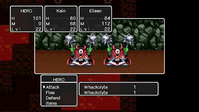
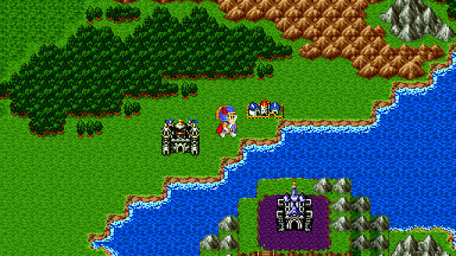
The problem, to deal with the bugbear right from the start, is that these games all look absolutely terrible. Rather than bring us the original titles and original art, Square Enix, in its infinite wisdom, decided to instead bring us the “modern” versions of these games, which use the sprites and other “art” elements taken the mobile phone ports of each.
On the Switch screen, the effect his hideous. On the big screen, playing with the console docked, it’s even worse. The sprites of modern Dragon Quest are “better”, in the sense that they feature smoother curves and greater details than what we saw in the 8-bit graphics from back on the NES, but aesthetically they are hard and ugly on the eyes, and exactly what you might expect from someone that decided to remake the games in RPG Maker using free, shoddy characters and enemy designs. With these remakes the classic Slimes, Drackys and other monsters are more bland than the iconically cheerful mob that you expect from Dragon Quest. Backgrounds, which do feature a degree of pixelation, clash horribly with the smoother character models, and the developer lost all control over colour in their original bid to make this all work on the (initially) tiny mobile screens. Blown up to full screen, they clash painfully to the point of inducing headaches.
The programming itself is shoddier than you’d expect, too. There’s a noticeable pause every time you encounter a random battle to the moment that the battle pops up on the screen. The action button isn’t anywhere near as responsive as it should be, and I found myself on many occasions reflexively pressing the button multiple times to try and hurry the action up. These are tiny issues in the grand scheme of things, but it altogether creates the impression of a series of cheaply made ports, ported as cheaply as possible, with no thought to the prestige of the series or the integrity of the property.
It’s an insult to Dragon Quest, and more broadly shows how little respect many game developers have for the classics in the medium. Dragon Quest and its first two sequels were never aesthetically poor. In fact, they’re all quite gorgeous examples of 8-bit art. To simply wipe over them with new “modern” sprites and art is akin to taking the Mona Lisa, and painting over wit a depiction of the feminine form, is now Miranda Kerr, before declaring that you’ve “modernised the classic.”
Sometimes it doesn’t misfire when a developer does this. The recent remake of Legend of Zelda: Link’s Awakening is a gorgeous game in its own right. But then looking at a painting of Miranda Kerr is not something I would exactly object to. That’s not really the problem, though. Just as with Disney’s 3D CG and live-action remakes of its classic cartoons, it’s hard to shake the impression that in each of these cases, the guiding principle for doing these remakes because there was something “inferior” about the originals. That’s an insult to the artistry of them, and those creators. “Realism” and/or “modernisation” is not inherently better, and invariably resources would be better spent going into making new games, or sequels to those classics that do use the “modern” art. And this is just for the stuff that is broadly aesthetically pleasing. When you’ve got classic Dragon Quest titles and remade them to look cheaper than the most unpleasantly cynical of Kemco’s mobile JRPGs, you’ve got something that starts to look like Square Enix is actively trying to lose fans.
The games are the exact same experience that was offered with the originals, in that they tell the same narrative, feature the same world and dungeon design, and the same characters. This is fine. All three Dragon Quest titles are classics of the genre for a reason, and while modern players will find them to be a limited grind (another reason not to bother trying to appeal to them), older players that grew up with this still will love the chance to re-live memories of playing these games. Or would have, if the visual redesign wasn’t souring the nostalgia trip.
I love the classic Dragon Quest titles with a passion, but there is nothing that redeems these poor ports. They fail as an archive of classics, since the redesign fundamentally changes them. They fail as pieces of entertainment, because they’re so ugly and poorly made. Finally, they fail as Dragon Quest, because Dragon Quest fans will be insulted by this trash being passed off as their memories.
| (All three: Dragon Quest I, II and III share the score since the issues that I have with all three games is the same) |
– Matt S.
Editor-in-Chief
Find me on Twitter: @digitallydownld
Please help keep DDNet running:
Become a Patreon!


