We need to re-think how we assess the quality of the graphics in our games

///
9 mins read


Opinion by Matt S.

One of the things that I have always found quite odd – and very limited – in the way that we talk about games is our understanding of what constitutes “good graphics.” Critics and the community alike do this; a game that has an intense level of detail in its art is considered to have “good graphics.” Meanwhile, minimalist or simple art styles inevitably attract criticism for their graphics.

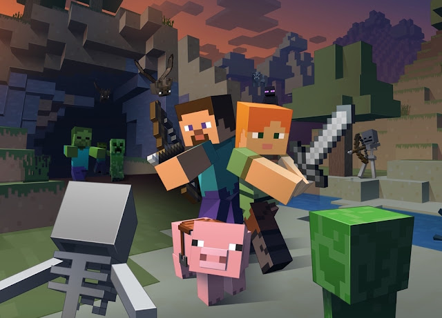
From Minecraft to games that use sprites, and on to minimalist indie games, what we see over and over again are comments that argue that the game is good despite its graphics. Over and over again Minecraft is called “ugly” and for minimalist games “simplicity” is used in a pejorative sense.

This is, frankly, a very poor understanding of art and aesthetics, and the conversation needs to shift as we start taking games more seriously as works of art. The reason Minecraft is so successful is because it is visually appealing. A minimalist game like The Unfinished Swan is simple, but that’s a good thing; it’s beautiful in that simplicity, and uses the minimalism with great purpose and effect.

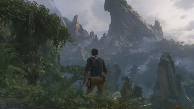
By contrast, photorealistic games, such as the Uncharted titles, are certainly beautiful, detailed in their aesthetics, but they are also about as intellectually deep as that stunning picture of a river in a forest that you have hanging up above your toilet. A game’s art can be used to enhance its thematic depth, and photorealistic art is often remarkably bad at nuance. Or to put that another way: money buys detail. It doesn’t buy art.

To read on, please log in with your DDNet Premium account:

“Graphics” vs. Art Direction

Sitting at the core of the issue here is a misunderstanding between the value of “graphics,” and the value of art direction, and what both of these things bring to the table. Art direction is what is actually important to the visual impact that a game has, and art direction can be spectacular without needing the kind of budget Naughty Dog had to pull together Uncharted 4.

What is art direction? In a simple sense, it’s the application of art theory to a game project that determines its visual appeal and aesthetic. It doesn’t have to be complex or expensive to be beautiful, and it certainly doesn’t have to be “realistic” – think about how many of the great paintings in the world actively reject realism. We know that art direction is successful if people find themselves attracted to the visual design.

Take, for example, really old games like Space Invaders or Pac-Man. Why have these games endured over the years, even as so many other games of that era have fallen right out of favour? You could argue that the gameplay itself is superior, and therefore the reason for the enduring popularity, and it is almost certainly a factor, but if that was the case, why are the Space Invader sprites and Pac-Man so iconic? If people didn’t find these pieces of art direction, as simple as they are, visually appealing, why would there be so much merchanise available for them to this day? The basic reality is that these games are popular in no small part because they are visually attractive.

For a modern example, would kids really be filling their rooms with Minecraft stuff if they found the aesthetics of Minecraft to be ugly? Of course not. Minecraft’s highly stylised and blocky world has already proven to be visually appealing – much as LEGO was decades ago, and continues to be today. People don’t have collections of those minifigs because they think they are ugly, and similarly, people don’t spend hundreds of hours playing a game that is not visually appealing.

Attractive is achieved in many more ways than through complexity. Art movements come and go, but the best examples of those movements art timeless. Few people paint cubist paintings now, but Picasso’s work remains invaluable. So too the impressionism of Degas, and so on. Pac-Man, that yellow blob stuck in a blue maze, is just as timeless, and is so because the art direction – though not the “graphics” – was so good. White mage and black mage are iconic Final Fantasy characters because their pixelated designs have inspired generations of game players.

However, when people talk about ‘quality graphics’ in this industry, they are often talking about the complexity of the underlying foundations. Uncharted’s ‘graphics,’ for example, are so perfectly detailed that they look like postcard, or the massive explosions in shooters are ‘graphics.’ From a commercial perspective, the money spent on creating highly detailed, complex, graphical environments and characters makes sense – people find this kind of visual style attractive, too, and it helps to sell copies.

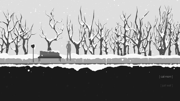
But I would argue that many of these “realistic” games aren’t especially artful, because the purpose of the visual design is more functional than purposeful. Uncharted looks beautiful, for example, but aside from providing a landscape to run around in, the environments aren’t really part of the storytelling process, and there’s not much point that those environments are making; they set the scene, but from that point their role in the storytelling is greatly backgrounded. By contrast, a game like I Am Setsuna clearly had a fraction of the graphics budget that the Uncharted games enjoyed, but the art was used as an active participant in the storytelling, with the endless winter motif really driving home the melancholic themes told through the explicit storytelling. For my mind, this is the definition of “good graphics;” when the game’s visuals actively support and become a participant in the storytelling.

Not that I’m criticising games like Uncharted here. They are clearly high quality games and the art direction is every bit the standard of Hollywood blockbusters. It’s fun, in other words. But it’s important that we understand that a game can look as simple as I am Setsuna or, for an even more extreme example, a game like Three Fourths Home, and still have “good graphics.” It’s important that when we’re talking about games, that we understand the distinction between the technical side of graphical production, and the art direction. A game does not need to be an expensive example of the former for the latter to be of a very high standard, and ultimately, it’s the latter that determines the quality of what we see as we play.

– Matt S. 
Editor-in-Chief
Find me on Twitter: @digitallydownld

This is the bio under which all legacy DigitallyDownloaded.net articles are published (as in the 12,000-odd, before we moved to the new Website and platform). This is not a member of the DDNet Team. Please see the article's text for byline attribution.

Previous Story

Review: God Eater: Resurrection (Sony PlayStation 4)

Next Story

review-adr1ft-sony-playstation-4

Latest Articles

>