I really like the idea of the Nintendo Wii U as an art platform. The gamepad has just the right screen size and precision to allow people to create reasonably complex art work. Unlike, say, the iPad, the stylus of the console is also perfect for the kind of fine details that you’d like to achieve when doodling away.
We got a taste of what the Wii U would be capable of with the paid-for demo of Art Academy. While that ‘game’ never quite ended up with the feature sets that it had initially promised, Nintendo does have a full Art Academy title on the way, and that will be a worthy purchase for aspiring artists, assuming that nothing goes dramatically wrong with its development.
But even if that Art Academy never happens, even if the only other art program available on the Nintendo Wii U is the limited Art Academy SketchPad, then My Style Studio: Notebook is still not going to be a sensible purchase. It’s not that the software doesn’t work as the virtual package promises, because it does. It’s just that it’s a confusing bit of software that doesn’t make a whole lot of sense in the world of modern art apps.
Upon loading the software up, you’re presented with a blank virtual notebook, that you can scribble on the cover just as you would do with school notebooks. I naturally scribbled all kinds of lewd things to go with what happened to all my notebooks back when I was at school (hey, nostalgia, right?), and then flipped over the page to start with the real art.
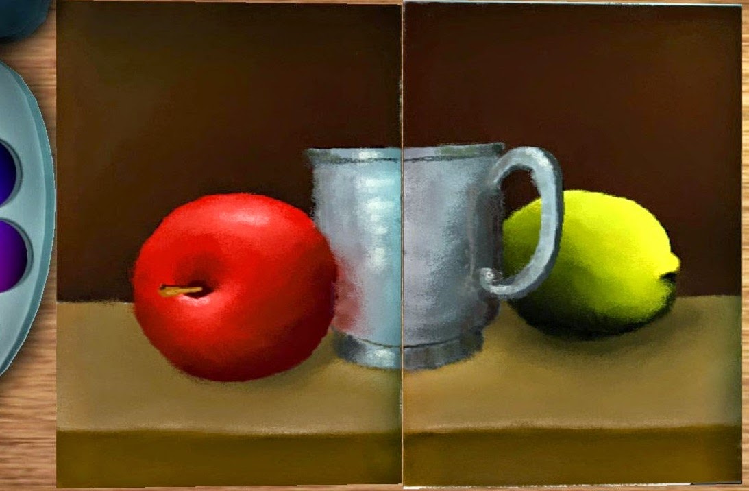
But then the confusion starts. The actual area to draw stuff takes up a tiny quarter of the screen real estate, and is split down the middle, like a notebook. The rest of the interface is taken up with a wooden background to suggest a table, and then various paint tools that are positioned around it. Now, it is possible to zoom into the booklet to focus on drawing something, but constantly zooming in and out quickly becomes annoying, and there’s no way to do anything about the page divider down the middle. I appreciate the developers wanted to create an atmosphere to contextualise the interface, but a basic rule of interface design is that you don’t compromise functionality in order to make things pretty.
The art tools themselves are relatively robust and it’s possible to make some reasonably complex pieces using My Style Studio. There’s even a few little bonuses, like being able to take photos and integrate them with the image, and it’s possible to flip through the pages quickly to create basic flip book animations. These are gimmicky features, but they do instill a sense of fun to the package.
But then the export options are incredibly limited. As long as you haven’t used a photo, you can post it to MiiVerse, but that gives you a low resolution image at best. And even if export to MiiVerse is enough for you, you’re still going to be able to make better quality images on Art Academy: SketchPad.
It’s becoming increasingly difficult to see the value in art packages like My Style Studio: Notebook. People who are serious enough about art surely have some kind of art tablet from Wacom or similar for their PCs, or at the least an Android tablet or iPad and a good art app. With minimal export options, even Art Academy is going to struggle to appear to people as anything more than a bit of gimmicky fun. And Art Academy doesn’t have the same interface and functionality issues as this does.
– Matt S.
Editor-in-Chief
Find me on Twitter: @digitallydownld

.jpg)

.jpg)


