Wow is Lunar: Silver Star Story a great game. In a genre that has had its fair share of great games, Lunar’s story is breathtaking in its epic scope and genuinely compelling characters. Its release on the iPhone is a big deal for fans of classic JRPGs.
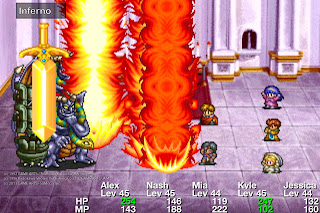
So, a bit of history first. Lunar is a game that has been released on the PlayStation/ Saturn/ Windows and GBA in the past. It features some 80’s style cut scene animations to break up some gorgeous in-game sprite work. The story is reasonably traditional and anyone who has played a JRPG before will find it all very familiar, but thanks to some simple-but-effective dialogue it’s compelling.
The combat is also traditional turn-based fare, but quite strategic nonetheless. The game’s difficulty has a nice curve – nothing that some grinding can’t overcome, but clever players should be able to get through without even needing that. One of the nicest elements to the game is that it has some spatial strategy to it. By that I mean that characters and enemies can only move so far each turn. By having your front line charge into battle, it is therefore entirely possible to build a human shield wall to physically protect the back row. Where Final Fantasy and other such games would simply reduce the chances that the back row would be hit by an enemy attack, in Lunar it’s strategically possible to take control of that element of the game which helps deepen the combat system.
For JRPG fans, this is an essential game that, if you haven’t played it before, you really need to go and get yourself a copy.
But do yourself a favour and don’t touch the iOS version. This port is precisely why iOS gaming has a bad reputation – even I, who plays iOS games daily, found this unplayable.
Surprise, surprise, the problem is the interface. Before I get on to the game itself, though, one of the most noticeable things about this game is that the iPhone’s time and battery power display is not hidden – it remains on the top of the game the whole time you’re playing. Some would claim that’s a good thing – after all, it means you can tell the time and see how much battery your iPhone has left. Some, but not many. The reality is that that little bar completely ruins the atmosphere of the game.
It’s but a minor irritation in the grand scheme of things though. The real problem is the controls. They are appalling. There’s two different ways to play. By holding the phone in portrait, the top half of the screen becomes a tiny window into the game world. The entire bottom half is taken up by a virtual controller, and yet the buttons still manage to be too squeezed together to be comfortable. The cramps that this set up causes, as well as the inability to see anything in the actual game on the tiny half screen is deeply preferable to the horror of turning the iPhone on its side.
In portrait mode, it’s possible to tap on the screen and then drag the finger in any direction. This creates a “floating” virtual control stick, and this actually works quite well. The problem is that it’s also possible to tap on the screen and the characters will auto-path to where you’ve tapped. So, half the time, you’ll be trying to move your characters around and you’ll inadvertently send them in a random direction you had no intention on having them move.
Or, you’ll try and direct them around by tapping directly on the screen, only to discover that the pathfinding is terrible (characters get stuck on scenery constantly), and it’s impossible to talk to villagers and other NPCs this way because those NPCs move around, and you still need to tap a virtual button to start a conversation with them.
I’m sure at some point these issues will be resolved via updates, but the overall issue with these criticisms is simple – this is a very, very lazy port of a very, very good game. It actually offended me. The iPhone is capable of far better optimisation than this. On the assumption that there will be updates, though, I’m giving this a better score than it currently deserves. If down the track it’s turned into a good port, then it’s an essential, 5/5 title.
– Matt S

.jpg)






I was curious how this game would control, having heard that they were going to do some control options built just for the touchscreen. This has always been a favorite RPG of mine, so it's a bit disappointing to hear how it handled in this instance.
"this is a very, very lazy port of a very, very good game. It actually offended me. "
Yesss….that is the gist of what I read in the toucharcade forums. I might get a bit ranty here, but what in the world were these developers doing in the past 3-4 years since their last release (Vay)? Clunky user interface, frequent crashes, inelegant ideas such as the always-on battery display (why not just display it only during a status menu check?)
What is going on there? Is it just one very busy dude working on this as his third job?
The saving grace I suppose is that iOS allows constant iteration of the product once released and I hope that is what happens with this game. That they fix it. Because it deserves the right treatment. So I can buy it and play it.