 |
| How many polygons in this utterly gorgeous game? |
If you’ve been in your local video game store lately (which is unlikely if you only read digitallydownloaded.net. We love you guys), you probably overheard conversation between two guys talking about a new release. If you’re the type to bother to continue listening to this kind of thing, you know that usually it’s them debating the pros and cons of the game they’re clutching in their crooked gamer hands. One point in this aimless argument that always pops up is “YEAH, but the graphics were X”.
Graphics are of course a vital component of games. It is how the players’ interaction with the program is displayed and represented, and in the process can display a lot of gratuitous blood, violence and boobs; all of which I don’t have a problem with when it’s in the right context. As soon as the industry was out of its infancy and able to look back and differentiate between then and now there’s been a question: are graphics better now than they were in ages past?
Of course the vast majority of you are going to say “why, of course! We have more than six colours now!” and the rest of you are going to say “here comes Nostalgia Goggles: a Love Story”. But, no, think about it reader; are they better?
To answer that, let’s take a step back here.
 |
| You used to be wowed by this |
Go back in time (using a DeLorean, obviously) to the midpoint of the original Xbox’s supremacy in 2003. And an even better example? Look at the original PlayStation. You’re watching the world marvel at the graphics of these godlike machines, and no one had been subjected to a rickroll. Life was good.
You step into a 12-year old’s bedroom and you tell him his graphics are crap. He responds “NUH UH!”, and you try and find the words to explain to him why, but you can’t. You’ve just realised that he has nothing to compare it to and therefore these indeed are some of the best graphics around.
What I’m trying to get at here is that everything gets more awesome or crappier in hindsight; and oftentimes graphics become crappier because there’s always a marked increase in console power over time.
I’m going to take this a step further and say that graphics have always had the same technical impact because we’ve had nothing better to compare it to at that present moment in time; so really, developers are effectively running in place.
 |
| No one would claim this is a “beautiful” game |
So in reality, we can’t use polygon count and general shininess in assessing how good a game’s graphics are because it’s going to get shot down quickly enough by the next generation of hardware.
And yet, on the other side of the coin, there are some games that definitely look better than others. So what an earth can we use as a benchmark for saying what’s better than the other?
Here I believe that the answer lies within art direction.
The heart of graphics is to express exactly what the game is about, and what sort of mood it conveys. Be it super serious horror-survival or frivolous arcade title; and it’s here where art direction steps in. Whoever’s in charge of this has a big job to do; their task more or less is to sum up the feel of the game, and bring together gameplay, writing and agenda into once nice pretty little package.
Sometimes this basically just involves designing guns with chainsaws attached to them, but others require more thought. Let’s take Zelda as an example. What is Zelda? How do you sum up the Zelda experience in game? Should it be reckless fantasy abandon or should it be slightly more restrained? Cell shading? How about darker and edgier? I use it as a touchstone because it’s gone through so many metamorphoses in its 25 years of existence, successive directors adapting with how Zelda changed over the years, and more or less got it right.
 |
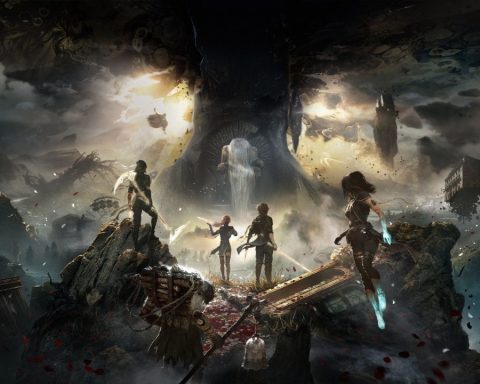
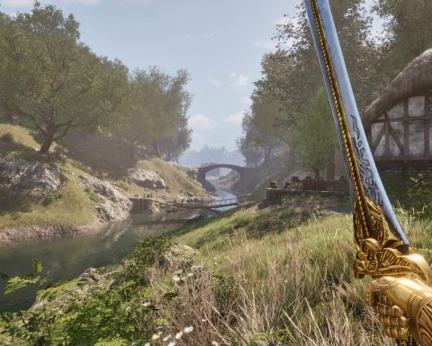
| Modern games can, of course, be beautiful. But rarely do they push the most polygons |
I’m going to go into a little bit of detail here and say that the early Zelda’s (the original to Majora’s Mask) were just about saving a princess and defeating evil. There was no pretense to it and it did what it said on the box, which was emulated by its simple graphical structure. When it moved into its middle period, it was marked with horror by some fans because it used a lot of solid colours and simplistic character modelling; catering to a younger generation of players (or “cash cows” as Nintendo calls them), and this was what I talk about when I say “bad graphics”, not because it was poor quality, but because it just wasn’t Zelda.
Bioshock is an example of things that were done right in this area. The Bioshock concept was all about Rapture; the social, moral and ideological decay of the city, oh, and the fact it was at the bottom of the Atlantic. The crumbling buildings and rusting pipes, those goddamn shadows on the walls, the rivulets of water dripping from the places where sections were sealed together, everything just screamed Bioshock. You couldn’t pull out any digital prop, setting or character design out of Bioshock and plonk it into another game because it just wouldn’t fit. It’s too specific and effective where it is.
 |
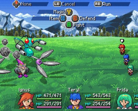
| Sprite art. Games developers are increasingly forgetting how to do it. |
All of this makes a game timeless. Any readers old enough to remember sitting down with your SNES or Megadrive already know what I’m talking about. The sprites haven’t aged a day, whilst original XboxChrono Trigger, Zelda, Final Fantasy II, Bioshock, Okami and dozens of others will not age. Ever. It’s because they defy the whole idea of shininess, they just take an idea and run with it until all you see is a perfectly coloured blip on the horizon.
I’m going to sum up because I’m getting all excited and nostalgic, and my SNES is looking ever so inviting.
You can make a game polished and shiny and put enough polygons into a single frame that will defy every computer’s efforts to render it, but that does not mean it has good graphics. All it means is that it will make your PC lag. To have the very best graphics, a game needs to be represented correctly by what’s being displayed on the screen, be it 8 bits or 24.
I guess when it all comes down to it, the question here is not: are my eyes bleeding? But rather: am I having fun? I think we forget that too much sometimes.
– Zane M


