The game is one of the modern classics of board games – a Eurogame that is both competitive and at the same time casual, challenging but at the same time features a manual smaller than Monopoly’s.
At its core, Puerto Rico is about building up a town with various production buildings, building up a number of plantations – corn, coffee, tobacco and the like, and then shipping the produce for profit. Within that concept is a remarkable variance in strategies on offer – do you focus on selling expensive goods for the highest individual profit, or produce massive quantities of cheap goods and make it up on numbers? Or do you aim for victory by having the biggest and best buildings? There are plenty of ways to play, and fine tuning your preferred strategy is a real joy.
It’s also a family friendly game – there’s some competition involved, but for the most part, each person takes their turn and goes about things their own way, uninhibited by the opposition. There’s no luck or dice involved (which is why games like this will always be superior to games like Monopoly, where the result is in many ways predetermined), and though it might sound complex on paper, most people will come to grips with it in just a game.
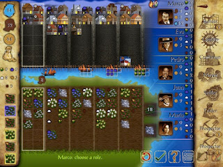
The problem is that the iPad version goes out of its way to complicate things. The “how to play” and “help” tips are going to confuse new players. The screen does a poor job of representing important information. Data fills most of the screen real estate, meaning you constantly need to be looking at everything to understand how the game is flowing. Important icons are tiny, and the board itself is uninspiring to look at. At three players (the minimum), it’s a challenge to follow this version of the game. At five (the maximum) it’s a downright nightmare.
It doesn’t help that there’s only one AI skill level, either. Newcomers will be crushed as they try and understand this game. If they keep playing they’ll hit a point where the AI will be far too easy to bother with. Which is when they’ll head online and be disappointed all over again.
Online is a similar mess. Although the developers did a great job in including ELO ratings (a ranking system which, while controversial, is a more scientific way of assessing skill than most), there’s no lobby. There’s Game Centre match making, but a lobby, where you’d be able to see who’s playing and how many are playing, is a much more encouraging way to find a match then a “tap and wait and hope for the best.” A couple of months down the track and it’ll be impossible to get an online game of this going, unless you have a lot of Game Centre friends with the game as well.
At least there is local multiplayer. But you’d be better off getting the real board game for that circumstance.
Perhaps I was spoiled with Ticket to Ride, but board games on iPad can work better than this. I am really, really disappointed that one of the most well-regarded board games of the modern era has struggled to make the move to the best device for board games out there on the market.


