This can’t be good for my mental health. Magic: The Gathering Online – you know, the digital version of the real game, complete with the innumerous packets of cards you need to buy to get the perfect deck – was let down by one thing and one thing only – the interface was about 10 years old, and looked like it was 20.
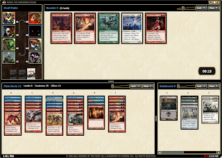
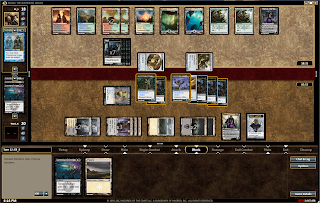
Wizards of the Coast have developed a new interface that is lovely and modern, but also light on computers – even my terrible laptop will run it.
Here’s a run down of the features, according to the press release Wizards sent through:
• Streamlined download: 5 minutes vs. 2 hours
• Improved drafting and limited deck building scenes
• Updated navigation and visuals improve usability
• Combined collection and deck editor simplifies card management
• Floating windows take advantage of high resolutions and multiple monitors
• Full access to deck building, casual play, trading, and store
So… see you over there I guess.






ahhhhhh – I need to steer clear of this. Already.. play… too… much… Magic… 🙂