 |
| Game needs more of this… |
Another year, another sports game. Where the likes of FIFA go from strength to strength, the team management games continue to bubble away under the surface, very niche and never quite getting things perfect. Premier Manager 2012 is no different.
Starting the game up, the first notable was the music, which was something of chirpy tune that reminded me of sports games from the 16-bit era. Being new to this series, I found the game to have something of steep learning curve, and since there were no tutorials built in, it took me a bit of time to get familiarized with everything. You start with a team selection screen providing a fair selection of teams to choose from. I chose Arsenal and moved into a home screen where you could see emails from the club Chairman and some news posts talking about league.
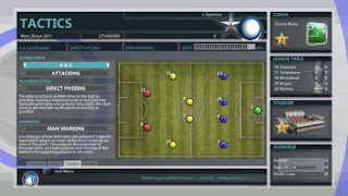
Moving on, there was a small notification in the lower left corner of the screen indicating that the R1 button would bring up the Hub Menu. This was easier to navigate and actually reminded me of the PlayStation 3 XMB, which I liked quite a bit. Even without training or help documentation, this part felt intuitive and I was able to get around from one option to the next quickly and easily.
 |
| And less of this |
As a team management game, think of Premier Manager 2012 as sports simulation based on decisions and strategy and not a more reflex-based title like the FIFA series. I began by putting special attention into my goalkeeping and made a couple of transfers. I then looked around various statistical categories, examined my income and looked at options such as improving my stadium. Then it was time to start play. At least, I hoped it was. I could not actually find the option to initiate a match. The Home screen had the inbox messages and stats tab, but nothing to initialise the match. I went back into the Hub Menu.
Home, Manager, Coach, Scout, Physio, Club, Competition, Leaderboards, Favourites and options – these are the menu items presented. I thought maybe the option to start a match would be under competition or maybe club, but no luck. I then went around to various menus looking for a way to advance. I then noticed something I had not before – the Chairman inbox items have a ‘confirm X’ option in the lower-right corner. You could read the emails without hitting that, but it turns out each of them needs to be ‘officially read’ by pressing X. Once you do that in the Home page, a ‘Next Day O’ comes up and allows advancement.
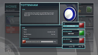
The first day I simulated, an injury came up. Get used to those – you see injuries frequently. The Physio report was nice and simple – you could see the issue and how long they were expected to be out. I was then hit up for a player loan, and I played around with the options for a bit before settling on one and continued my daily advancement. This is all very menu-driven stuff as I then proceeded to set up some friendlies, discuss a sponsorship and more loan offers.
Next I made plans to update my stadium and medical facility. The Chairman however, did not care for my plans for a top-end medical facility and rejected my proposal. I went back to get a moderate upgrade. There are some interesting RPG elements like experience for your coach and upgrades for your facilities that give the game some additional depth.
Then it was time for my first match.
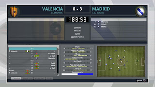
The peg-like characters move around in the lower-right corner of the screen as they simulate the game, which is in and of itself fine as it was interesting seeing the strategies brought to life on the screen, but it all felt very lifeless. The best comparison I can make to illustrate this is recalling those old electric, vibrating NFL football tables from when I was a little kid. Where you would put the ball down, line up your pieces, turn it on and watch them move around randomly on the shaking metal surface. Premier Manager 2012 looks a lot like that in action.
There is canned crowd sound that ebbs in and out in volume, and with no music or commentary the entire presentation felt like it was lacking the enthusiasm of the sport itself. The live, constantly updating stats did a nice job of portraying what was happening, right down to the Possession percentage bar at the bottom to give you a nice visual representation of how the two teams’ attacks have fared. While only getting to perform about five interactions during the match itself, the game lasted 57 minutes of real time on normal, which seemed excessively slow.
The match on fast is much better, and felt like the only way to play. You really cannot tell what is going on in the simulated action window, but spending nearly an hour just watching the screen while not doing hardly anything to interact with the game just is not all that much fun. Here, I was able to wrap up my second match in three minutes.
A couple of technical issues. I had read that the trophies for 200 games and the 10 win streak currently do not work, and I can confirm that I was 12-0 and still never got the 10 win streak trophy to unlock. A few others have complained that their trophies from this game do not sync on the network to other systems their ID is on. Lastly, I had three matches lock up during play, and that was on two different machines (one slim and one old style).
The strategic and RPG elements add a sense of progression. Unfortunately the confusion in the game’s interface, the lack of interactions during matches and the somewhat bland presentation hold this game’s intriguing premise back. What you get is a very niche title that does a few things right, but misses the mark in too many other places to truly recommend it to most gamers.– Nick H is the owner of his own blog, Chalgyr’s Game Room. Make sure you check it out!


